not saying this is a bad thing as the changes so far to the google search homepage look and seem not to be effecting the usual search experience you expect from web search engine giant google, everything seems easy and straightforward to use on the google search page.
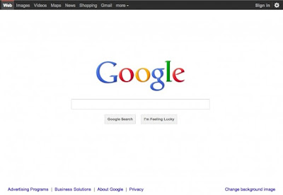
i did notice a week or so ago that there was some changes to google search as well with the top of the screen having a black bar colour, of course the rest of the page has stayed the same classic white colour with the multicoloured words google in the centre with the simplicity of the search box underneath.
but the colours are different and the words "google search" and "i'm feeling lucky" are in little grey boxes now.
just reading as well today google launched its social network site called google+ this week so i am wondering if this is one of the reasons behind googles classic search page changing slightly.
i think the new google+ is a kind of social network site similar to facebook, but it seems google+ is only in some kind of beta testing mode at the moment and not open to the public yet, until it has been tested a bit first.
but interesting to see the classic google homepage for searches change as well as the launch of google+ this week, will be interesting to see also what google+ is like when it gets its full release date for public use in the coming months!.
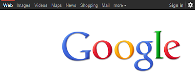
this is also what i think has happened to the google homepage if you look at the old style google homepage for searching the web it has more shadows around the google letters, like in this picture below, but now with the launch of google+ testing shadows are gone?, to try the new google+ plus project though at the moment you need to have been invited as google+ is only in the testing stages at the moment.
classic search page before google+ plus website testing launch

now this is what the new google search page looks like, which i think is linked to the testing and partial launch of the new google+ or "plus" social media function, notice how the navbar at the top of the page is now coloured black and the search page letters google have less shadowing along with some of other changes over the google classic look of old, google+ should make google even better though.

this is a video from google explaining the google+ project, now this looks interesting and different to facebook as well, actually looks very different to facebook in this video, though early reviews of google+ say it is very similar to facebook as well.
The Google+ project: A quick look
"We've been working on some new stuff to make sharing on the web more like sharing in real life. Come check out the first five features of Google+ at plus.google.com"


No comments:
Post a Comment